Site Designs Left by the Wayside
I wrote in a previous entry that I designed too many versions of this site and wanted to stop. While that entry talks about how I ended up with the current iteration, I saved several of the unused versions. Here are a few mock-ups of those iterations, along with brief notes about my thinking process. You can kill your darlings, but that doesn’t mean you have to forget them forever.
The Altered Photos Version
This is one of the earliest versions I created. I grabbed images from Unsplash that represented published pieces of my work. I edited the pictures to be minimalist and suggestive, and I added text from my stories related to each one. My two main reasons for not using this version are: 1) the feeling the images and text create are inconsistent and chaotic across different pages, and 2) the images and text scale poorly on mobile screens.


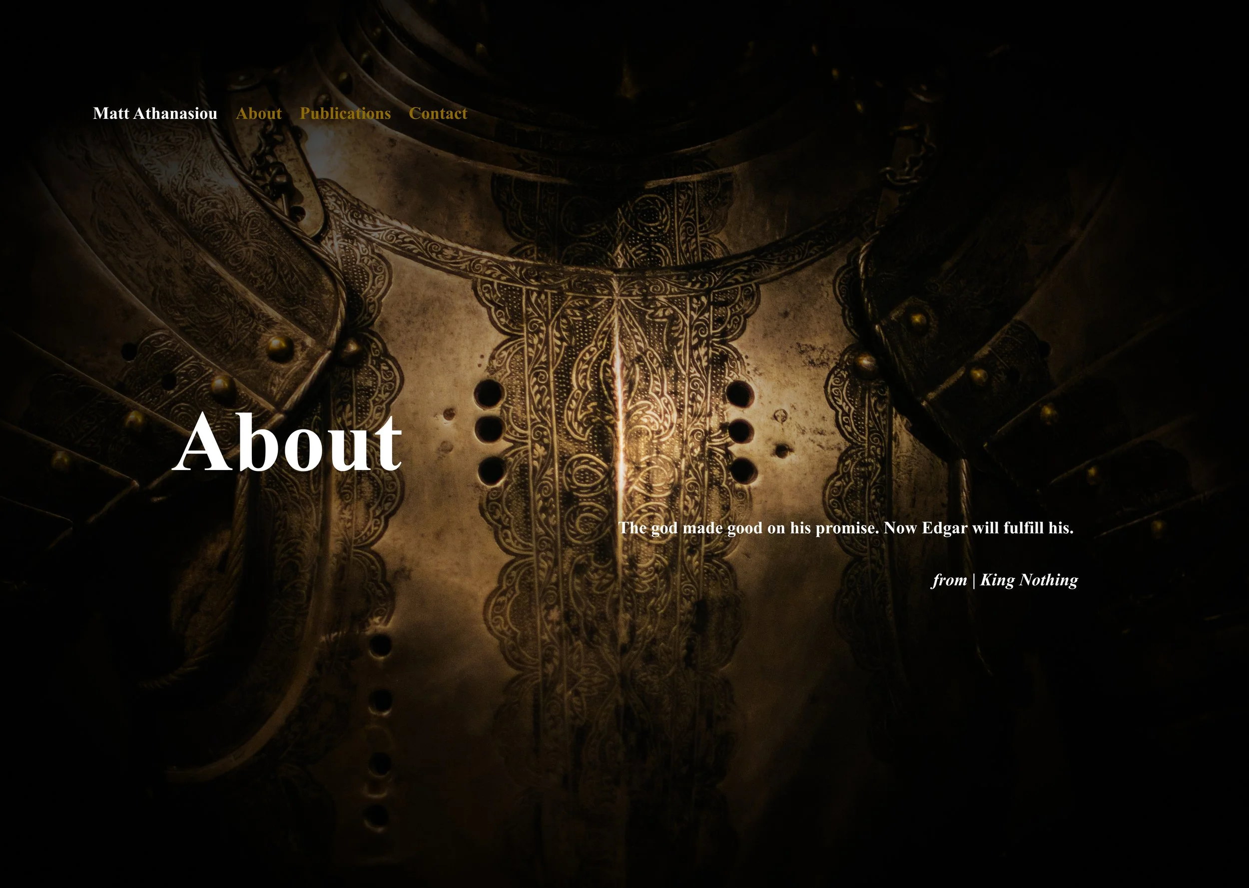
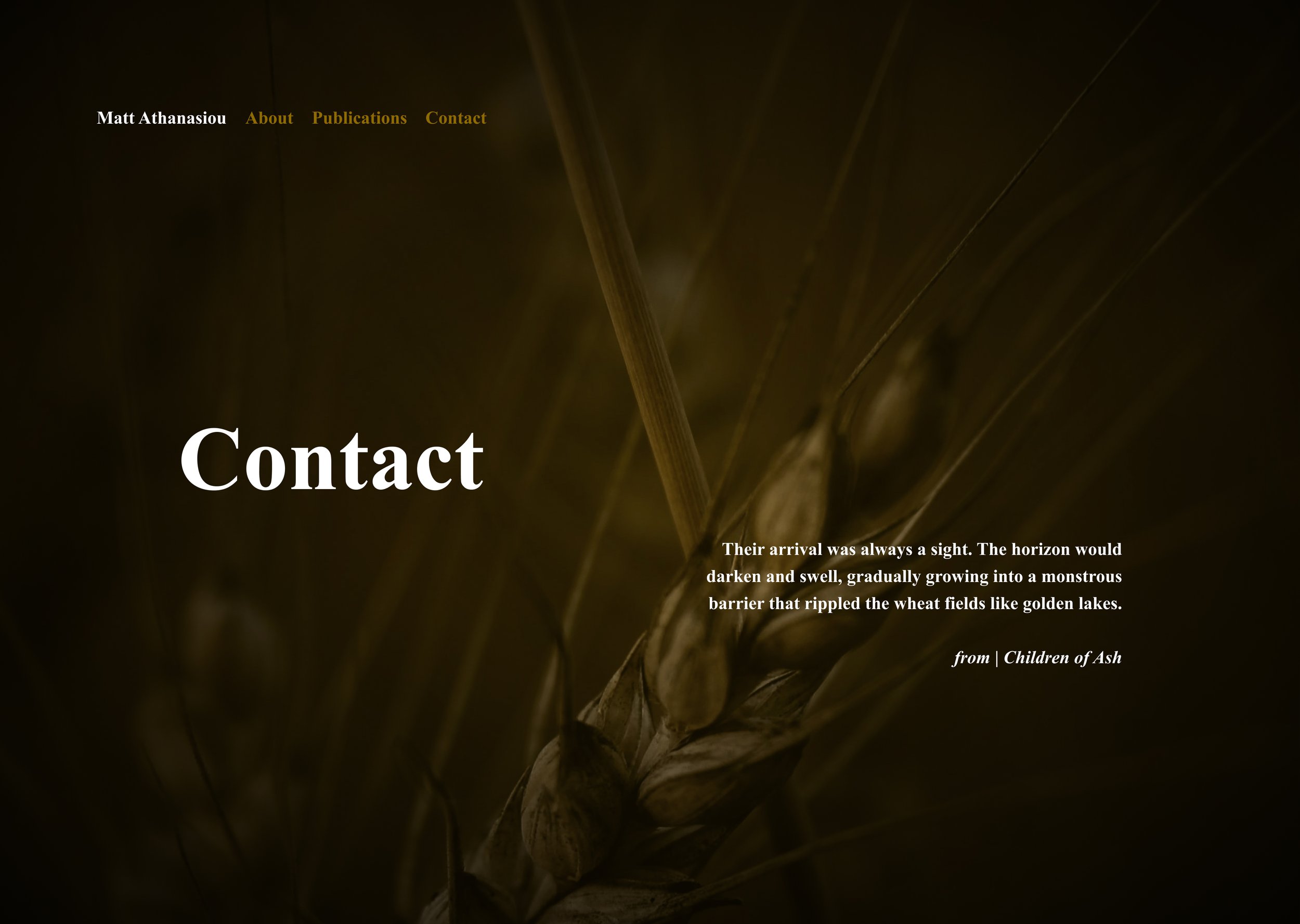
The Darkly Colored Altered Photos Version
This concept is similar to the Alter Photos Version, except that I leaned into the original images more. The dark edges and subtle colors create a sense of mystery, and the quotes from my stories give a preview of the type of writing I typically do. The text is no longer a part of the images—unlike the first version—which helps it scale better on smaller screen sizes. I like this concept, but I decided against using it, because I constantly found myself second-guessing which stories to use quotes from and which pictures to use. Additionally, this version felt like it was missing a smidge of playfulness that can also be found in my writing.
The Dark Fairy Tale Version
I love fairy tales, with an even softer spot for the dark ones. While some of my stories can be labeled dark fantasy, this version of the site gives the impression that the genre represents all of my work. I appreciate the consistency of this iteration, but I wanted a more accurate representation of my writing.
The Dark and Playful Version
I enjoy writing children’s literature from time to time. I allow myself to use more lyrical language and fantastical ideas when I write in the genre. In this version of the site, I leaned into playfulness by adding weird doodles and writing each page like it was a book chapter with a summary. Ultimately the site felt like it skewed too heavily toward children’s stories—albeit darker ones.


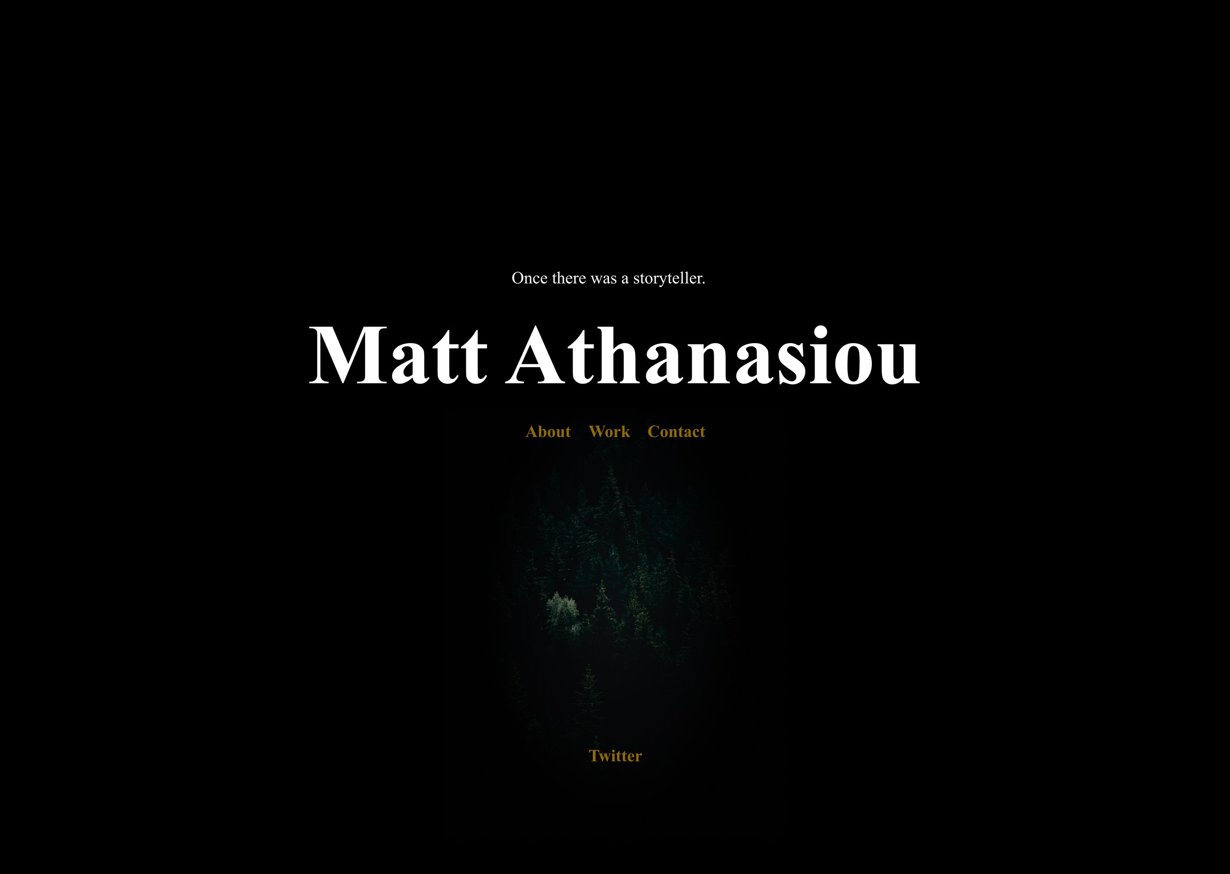
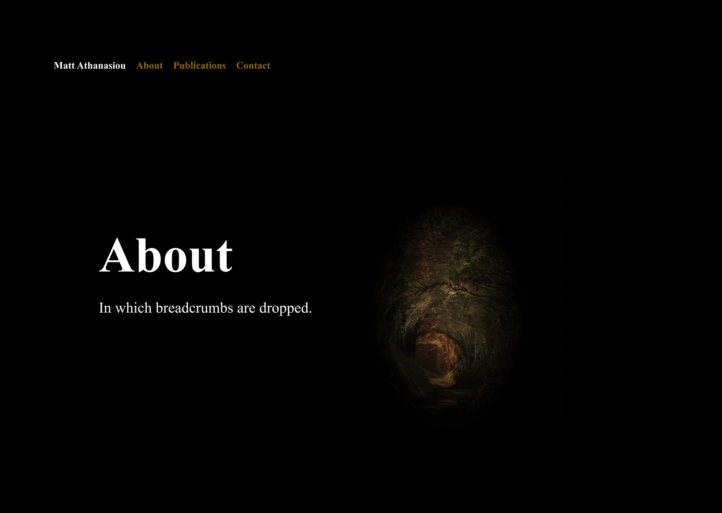
The Literary Designer Version
I dig this version, how it leans into the text. On the home page, I like the large M/A symbol juxtaposed with the small prose type, and the color distantly reminds me of aged paper. Subsequent pages utilize large stylized prose for headlines, which feels both like chapter titles and summaries of each page’s content. The main reason I didn’t use this iteration was that I became burned out on designing the site, and I wanted to take a step back before choosing a final direction. That was when I thought up the concept for the current site.


Have thoughts on these versions or want to share iterations of your site? Feel free to message or tweet me.